Displaying incunabula: a labour of love
The Library’s incunabula exhibition, Private Lives of Print: the use and abuse of books 1450-1550 opened to great acclaim on 23 October 2014. Thanks to a generous donation from the Howard and Abby Milstein Fund we are able to photograph every item in the cases for a virtual exhibition which will remain after the physical display closes. Given the short exhibition changeover period (only eight working days in this instance) the books were photographed in advance, many of them flat or as single pages, rather than in their final cradles.
There has been a great deal of interest from other specialist librarians and exhibition curators in the way we have displayed the books. The process of preparation for this particular exhibition was considerably more intensive than in previous cases; the theme of the exhibition focuses primarily on books as objects, rather than on the texts within, meaning that they need to be displayed in unusual and often unique ways. The Library’s Conservation team leapt at the challenges this created: how to show multiple openings at once; how to hang broadsides as if nailed to the back of the case; how to display a binding and its endpapers simultaneously. Some of the stands took several months to design, and were manufactured by Engineering Design and Plastics, a local firm. Other special features of the display, such as the maniculae pointing at marginal markings in our Gutenberg Bible, were dreamed up only in the last few days of the mounting process and created with a Blue Peter-esque level of ingenuity. The curators and exhibitions officers are immensely grateful to the Conservation team for their patience, imagination and dedication to this exhibition, and a few samples of their work are shown here. Some of the photographs were taken professionally at the exhibition opening, others by a member of staff, so please excuse the variation in quality.
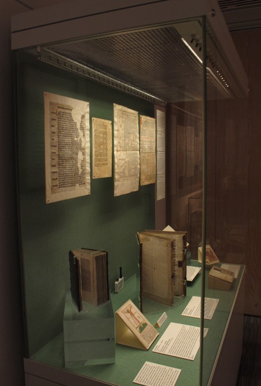
The cradles fall into four main categories: Multiple openings, Floating parts, Bindings, and Mirrors. Some books cross several of these categories, and these were the most challenging (and satisfying) to work with. All images can be enlarged, and item description are linked to the main virtual exhibition website.
Multiple openings:
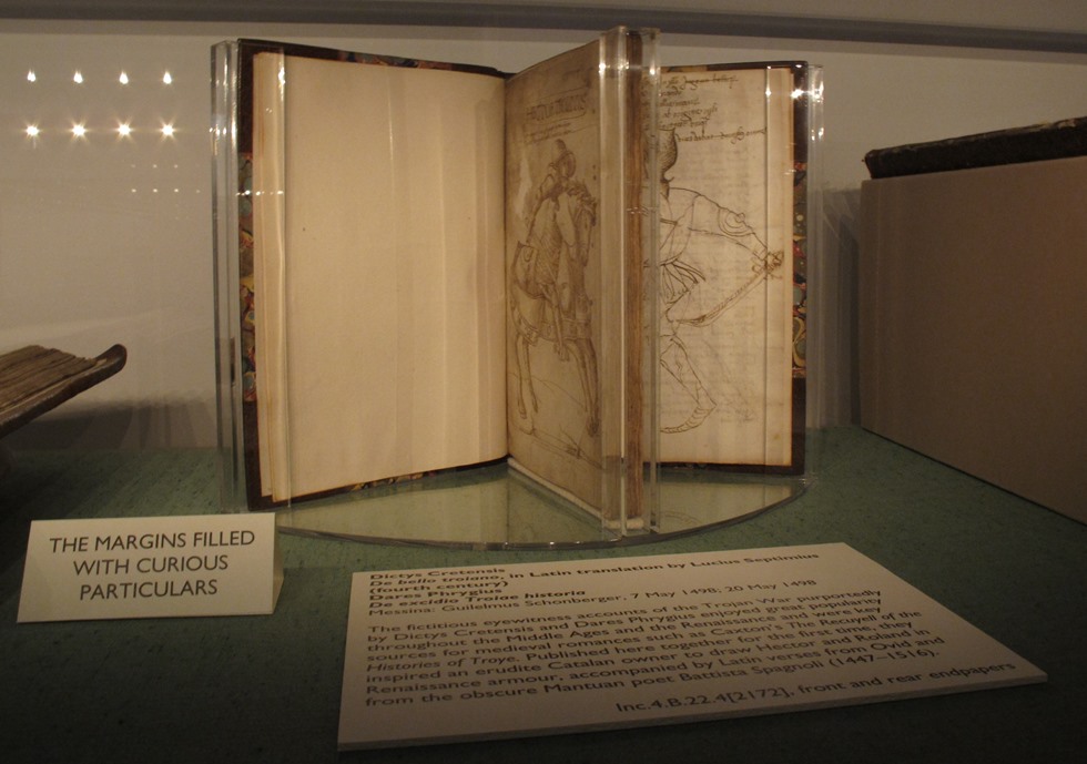
Sketches on the endpapers showing heroic figures
Above, classical figures drawn into the front and rear endpapers of a copy of Dictys Cretensis suggest that an early owner was inspired by the characters within the text. Below, two medieval manuscripts relating to the monastery at which this volume was boundin the late fifteenth century both used within the binding; they give vital information about the history of the book.
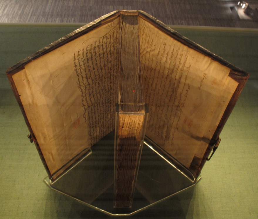
Two fourteenth century manuscripts from the monastery of Schussenried used within the binding of this volume
 The volume illustrated on the right was printed and illuminated in Venice in 1493; so far, so simple. Yet further evidence in the binding and annotations show that by 1520 it had been taken to Switzerland and bound there. For viewers to understand the full story, the annotations, illuminations and binding all need to be visible.
Floating items:
Broadsides ‘pinned’ up within the case
The main examples of floating exhibits come in the case discussing broadsides and other single sheet incunabula; the intention was that these would be displayed as in the fifteenth century, ‘pinned’ up to the wall of the case. This was achieved by attaching each broadside to a flat acrylic mount using small magnets, then hanging these from a metal rod using fishing line. They appear to float in the air, with their captions on a single sheet together at the end of the upper level of the case. In order to design this case, a life-size board mock-up was created in the Conservation studio, so that different options could be experimented with.
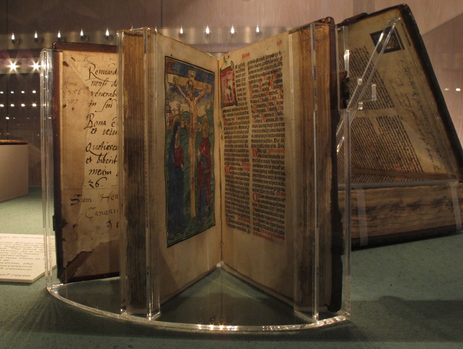
On the lower level a large missal stands upright with two openings on display; a crucifixion within the main body of the text, and an additional crucifixion woodcut pasted into the front board.
Two crucifixions on display within a single volume
A single leaf floating above a larger book
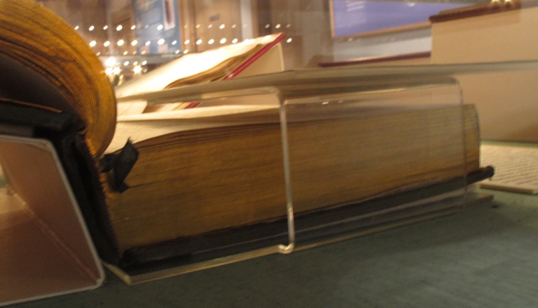
Detail of the stand holding the Festial leaf clear of the volume below
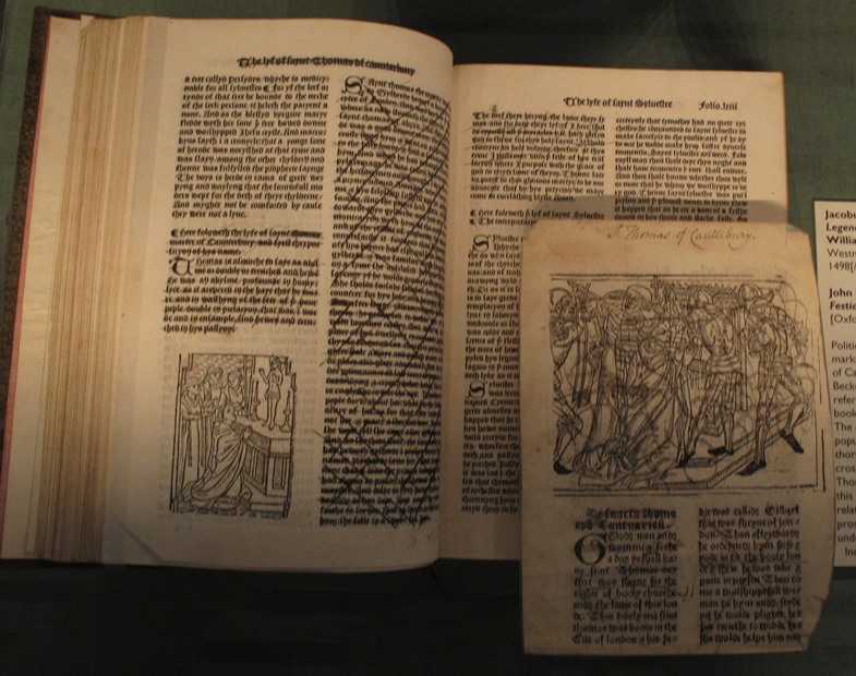
A pair of items showing signs of expurgation of outlawed saints during the sixteenth century is displayed not just side by side but one atop the other; a copy of the Golden Legend below, with a leaf of Mirk’s Festial above. The single leaf is ‘floated’ on an acrylic stand wrapped around the larger volume.
Finally a small touch added at the last minute: manicules pointing out the annotations made in the Cambridge copy of the Gutenberg Bible when it was used as exemplar in the print workshop of Heinrich Eggestein. The hands themselves were taken from an image in the Blockbook Apocalypse, and mounted onto small acrylic ‘arms’ which are attached to the cradle. These seemed better in keeping with the feel of the exhibition than a more usual red paper arrow.
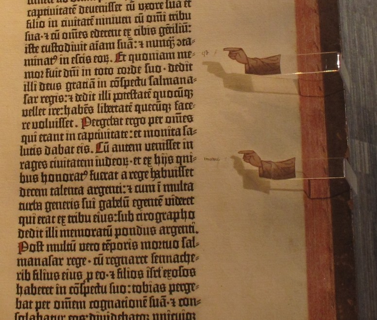
Manicules pointing at marginal notes in the Cambridge Gutenberg Bible
Bindings:
The annotation explains that this book was taken to Galilee by a Dominican friar
The binding of the Galilee volume, utilising a thirteenth-century manuscript fragment for lightness and portability
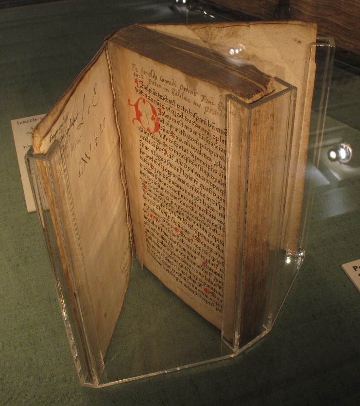
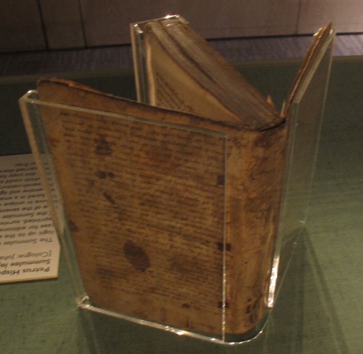
Many of the volumes in the exhibition have bindings which needed to be displayed in a way that enabled viewers to look at the text block or endpapers, then move around the case and see the binding as well. With smaller volumes such as this pocket-sized Summulae logicales this could be effected by standing the book upright, but for others more complicated solutions had to be found.
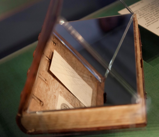
Mirrors:
Several of the items on display needed to show both binding and an internal detail, but could not be displayed upright because of their size and positions within the exhibition room. Examples include two volumes bound in Cambridge, one by the Unicorn Binder (1) and the other by W.G. (2). In both of these cases the front board is held upright by triangles of bent acrylic, with a mirror resting across the front endpaper. The third example is bound probably by Konrad Dinckmut for the brothers of Buxheim (3).
The structure of the binding visible both inside and out (1)
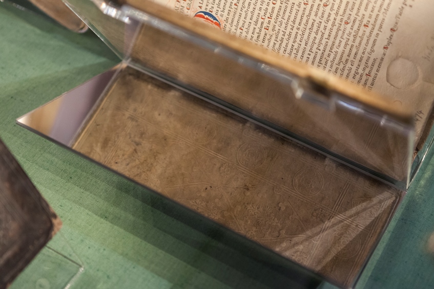
The detail of the tooling visible simultaneously with the text within (3)
A mirror used to show the endpaper (2)
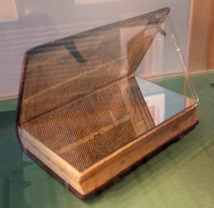
Mirrors, Binding and Multiple openings:

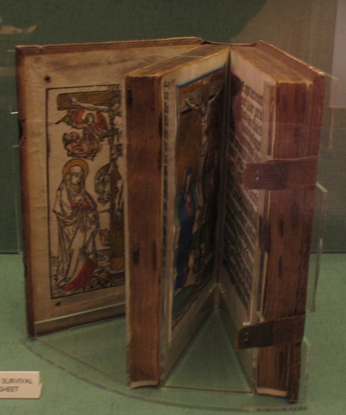
Six pages and two boards on display at once
Perhaps the star of the show in terms of complex display is this brick-like volume containing nine separate manuscript and printed items bound up together. We wanted to display several different parts of the book to illustrate the point that they had been brought together without discriminating between different media, and the size of the book meant this could only safely be achieved by resting it on its spine. This necessitated early decisions about which openings would be displayed, so the exact angle of the cradle could be set. An extension was added to hold the clasp, and a small gap cut in the sheet supporting the front board to show the catchplate when reflected in a mirror. The sections of text block were held together with polyethylene strapping, and small triangular wedges of acrylic were constructed in-house to hold the sections apart.
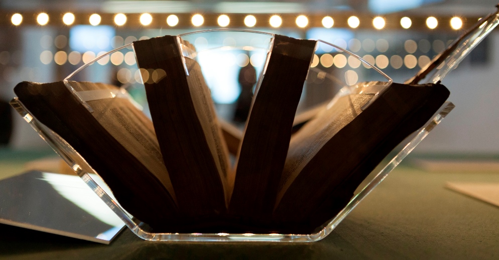
A single sheet of acrylic, acrylic wedges, polyethylene strapping and a mirror combine to display this book in a unique way.
What a great summary of the exhibition, and in particular the work the Conservation team has done! Reading between the lines, it sounds like they had a lot of fun dreaming up solutions for each book. Wonderful photos, too. Well done all!