Art in Books: Lambrecht Hopfer’s Crucifixion (c. 1525–50) in the Opuscula of Saint Bonaventure (1497) – A post by Elizabeth Upper
Cambridge University Library is one of the world’s greatest repositories of books, and many of these books contain artworks. Some were printed with the text (book illustrations), some were added to the text after printing (painting and illumination), some were bound into a volume, and some were pasted on by later collectors. Regardless of the kind of image, pictorial elements in books can provide art historians and bibliographers with important information about the interrelated ways in which both kinds of printed material, books and art, were collected, used and valued over the centuries.
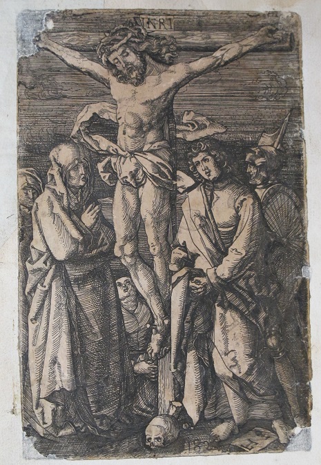
The copy of the Opuscula of Saint Bonaventure, Brescia: Bernardinus de Misintis, for Angelus Britannicus, 31 December 1497 (ISTC ib00930000; Inc.4.B.23.12[3713]) has a print of the Crucifixion with the Virgin and St John pasted onto the verso of the third upper free endpaper [Fig. 1]. The iconography, or standard visual formula, is a devotional image of the Crucifixion that traditionally faces the start of the Canon of the Roman Catholic Mass (Canon missae) in missals. The print is undated, and it is signed ‘LH’, the monogram of Lambrecht Hopfer (Augsburg, active ca. 1525–1550), in the lower right corner.
Engravings are made by incising a metal (usually copper) plate with a sharply pointed burin, and the V-shape of its tip usually results in lines that taper to pointed ends. It is a physical process, and the slow movement required to push the burin through the plate’s surface means that engraved lines are smooth strokes that cannot be jagged or freely sketched. Etching, in contrast, is a chemical process that allows for greater freedom of the hand of the artist. First, the plate’s surface is covered with a thin layer of a protective, acid-resistant substance, the so-called etching ground (Hopfer may have used plain beeswax), and the artist creates the design by scratching it away with a sharp etching needle. The plate is then dropped into acid that eats away the unprotected surface, i.e., the design. After the design has been eaten into the plate, the printer fills the grooves with ink, puts a sheet of damp paper onto the inked plate, and takes an impression in the press. In the Crucifixion, the lines are freely drawn and of consistent width with rounded (not tapered) ends [Fig. 2], so the print must be an etching rather than an engraving. Because Hopfer is known to have produced etchings only in the 1520s, it can be assumed that Hopfer designed it between c.1525 and c.1530.Engraving had been used to decorate gold, silver, brass and bronze objects since Antiquity, and etching had long been used to decorate items, such as weapons and armour, that were made from metals that were too hard to engrave, like iron and steel. Engraved copper plates had been printed from the mid-1430s, but etching was invented as a printing technique by Lambrecht’s father Daniel Hopfer (ca. 1470 Kaufbeuren–1536 Augsburg) in Augsburg around 1500. Lambrecht and his brother Hieronymus (Augsburg, active ca. 1520–1530) later joined Daniel in printing etchings. This means that the Crucifixion was designed in the first-ever etching printshop by the son of the inventor of this printing technique.
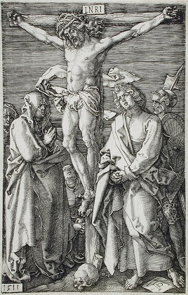
The design is a copy after Albrecht Dürer’s Crucifixion from The Engraved Passion (Nuremberg, 1511), of which there are three copies in the Fitzwilliam Museum [Fig. 3: Albrecht Dürer, Crucifixion, The Engraved Passion (1511); Los Angeles County Musuem of Art; public domain via Wikimedia Commons]. The two-generation Hopfer etching dynasty issued many reproductive prints. Only 16 of Daniel’s 146 known etchings reproduce or are modeled on other works, but most of Hieronymus’ 83 etchings and all but five of Lambrecht’s 39 etchings are copies after other masters. This not only tapped into established markets, but also may have helped to disseminate their novel technique. The model could not have been an etching—Dürer issued his earliest known dated etchings in 1515, and etching had become common by the next generation—so the choice of technique, or the reproduction of an engraving of 1511 with an etching about ten years later, manifests the transformation of the emerging technologies of printmaking at this time.
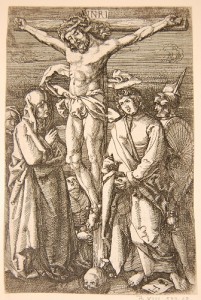
The print was originally designed without the number engraved in the lower margin [Fig. 4: First state: Lambrecht Hopfer, c.1525–50]. Like many of the Hopfers’ plates, the University Library’s print has a number engraved by a sloppy, later hand in the lower margin. This is called the ‘Funck number’ because the Hopfers’ descendant David Funck (Nuremberg 1642–1705) acquired over two hundred of their original iron plates, engraved numbers into them, and re-printed them around 1686-1700. The ‘182’ indicates that the Crucifixion was the 182nd print in Funck’s series [Fig. 5: Second reissue: David Funck, c.1686-1700]. About a century later, 92 of these plates were acquired by Carl Wilhelm Silberberg in Frankfurt and re-re-printed in the book Opera Hopferiana (Frankfurt am Main/Göttingen: C. W. Silberberg, 1802), of which the Crucifixion was the 90th print [Fig. 6: Third reissue: in Opera Hopferiana, 1802]. The addition of the Funck number indicates that this impression was printed from a sixteenth-century plate either 150 years later by Funck or 250 years later by Silberberg, but which one was it?
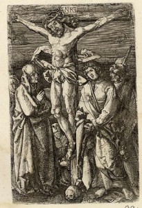
Fig. 6: Third reissue: in Opera Hopferiana, 1802. Courtesy Niedersächsische Staats- und Universitätsbibliothek Göttingen
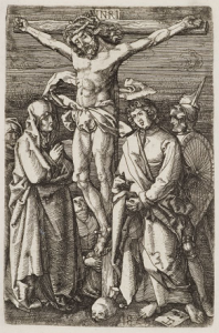
Fig. 5: Second reissue: David Funck, c.1686-1700. Herzog August Ulrich-Museum, Braunschweig, LHopfer AB 3.12; With permission
One clue comes from a technical detail of the print’s production. During the printing process, paper must be damp; this makes it flexible enough to be forced into the grooves of the plate in order to take the ink from the incised (sunken) areas of the design (copperplates quickly became standard for many reasons, not least because copper is impervious to rust). The Hopfers used iron plates, like many of the earliest etcher-printmakers, and iron rusts upon exposure to moisture. Rust is clearly visible on the Hopfer family’s iron plates, such as Daniel’s plate for a print of Venus and Cupid, c.1510, in the SUB Göttingen [Fig. 7a-b].
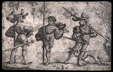
Fig. 7a. One of Daniel Hopfer’s original iron plates. Daniel Hopfer (c.1470-1536), Venus and Cupid, c.1500-36, 22.7 x 15.7 cm, etched iron plate. Courtesy Niedersächsische Staats- und Universitätsbibliothek Göttingen
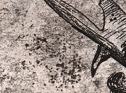
Fig. 7c. Detail of Fig. 7a showing rust spots. Courtesy Niedersächsische Staats- und Universitätsbibliothek Göttingen
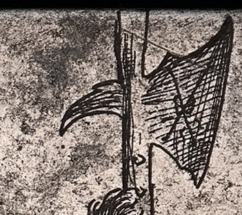
Fig. 7b. Detail of Fig. 7a showing rust spots. Courtesy Niedersächsische Staats- und Universitätsbibliothek Göttingen
Iron etchings can often be distinguished from copperplate etchings by the accumulation of rust spots; rust has an irregular surface that holds ink, so rust spots are also printed. In this impression, the small dark, printed streaks below Jesus’ right breast [Fig. 8] and near St John’s armpits and upper thigh are indicative of rust spots on the iron plate. Because damage accumulates over time—it is expected that the first state would have the least damage, the second state some, and the third state the most—it should be possible to identify when this Crucifixion was printed by comparing the damaged areas to impressions whose date of printing is known.
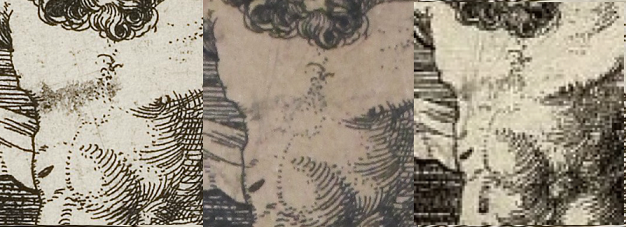
Fig. 8. Comparison of a rust spot in left: State I, c.1525–50; centre: the CUL impression; right: ‘State’ III, 1802
However, the results are not straightforward. In the few examples from the first state, all of which are on sixteenth-century paper and lack the number ‘182’, the same mark on Jesus’ chest is not only present but also significantly larger and darker. Since the present impression must therefore be from the second or third state, the apparent reduction of rust spots may indicate that the iron plate had been repaired. But that is impossible. Although some impressions from the second state have only that rust spot, others have the four disturbances. In third-state impressions, the four spots are also present and as prominent as in the first-state impressions. How can this make sense? The plate must have acquired the rust on Jesus’ chest early on. Rust can be removed from iron plates if it is only superficial, but evidence of the same rust spot in the first (c.1525-1550) and third (1802) editions indicates that this spot was not removed.
But rust can also be (at least partly) concealed if the printer carefully wipes the ink off of the rusted area before pulling each impression. Because the rust spots are far more pronounced in both the first-state impressions from Hopfer’s lifetime and the last impressions from 1802, the impression of the Crucifixion in the book must also have been pulled from a plate with the same rust spots, which were ‘hidden’ by the printer’s careful wiping. Although the plate seems to have been in the same condition as when Silberberg re-re-printed it in 1802, it is unlikely that it came from the Silberberg volume; all 1802 impressions I have seen are uniformly printed with no effort to conceal damage to the plate.
The Funck number reveals that this impression of the Crucifixion was printed after c.1686-1700 in the second or third state. The careful wiping of the ink, which is inconsistent with the Silberberg impressions, seems to rule out a dating to the third state of 1802. Although the paper is damaged and discoloured, and no watermark can be seen because it is pasted down, it can be tentatively dated to the seventeenth century; in any case, it is of a different character than the paper used in the Opera Hopferiana. On these grounds, it can be concluded that this is a second-state impression issued by Funck in the late seventeenth century.
What does this mean for Cambridge University Library’s copy of the Opuscula? Bonaventure (born as Giovanni di Fidanza, Bagnoregio 1221–Lyon 1274) wrote the text in the thirteenth century, and this collection of his writings was part of a surge of his publications following his canonization in 1484. The text was printed in Brescia, Italy, in 1497, and the present copy was bound soon after in Belgium; it remains in its late fifteenth-century Belgian binding. The book was inscribed with the name ‘Baillardj’ in the late 15th century, an inscription indicates that it belonged to the Carthusians of St. Mary in Brussels in the late 15th or early 16th century, and annotations in a continental Gothic bookhand also indicates its use in Belgium at this time. But then the trail goes cold until it was purchased from the local book dealer G. David, Cambridge in 1931.
The addition of this late-seventeenth-century re-issue of an early sixteenth-century devotional print to fifteenth-century theological text may point to the functional collecting practices of an active reader. Or, the book may have simply seemed like a safe place for someone to keep a print. We may never know. Regardless of why or by whom it was pasted in, it hints at the life of the book during the intervening 400 years. As a single-sheet print that was effectively transformed into a book illustration, and as an early modern work of art that was used to decorate a medieval book, it also expresses the flexibility of early printed material: the modern division of text (books) from image (art) came about long after these objects were first produced. In the broader view, it hints at the richness of invisible art collections pasted inside books in libraries.
Elizabeth Upper
